In 1922, Don Ramon Roces was plagued by an idea: Photo News. He believed that pictures conveyed messages and facts more clearly and more quickly; photographs reported the news better than text.
He experimented with two publications that demonstrated his concept—Photo News, the first trilingual publication in English, Spanish, and Tagalog, and Liwayway, the first Tagalog literary and lifestyle magazine.
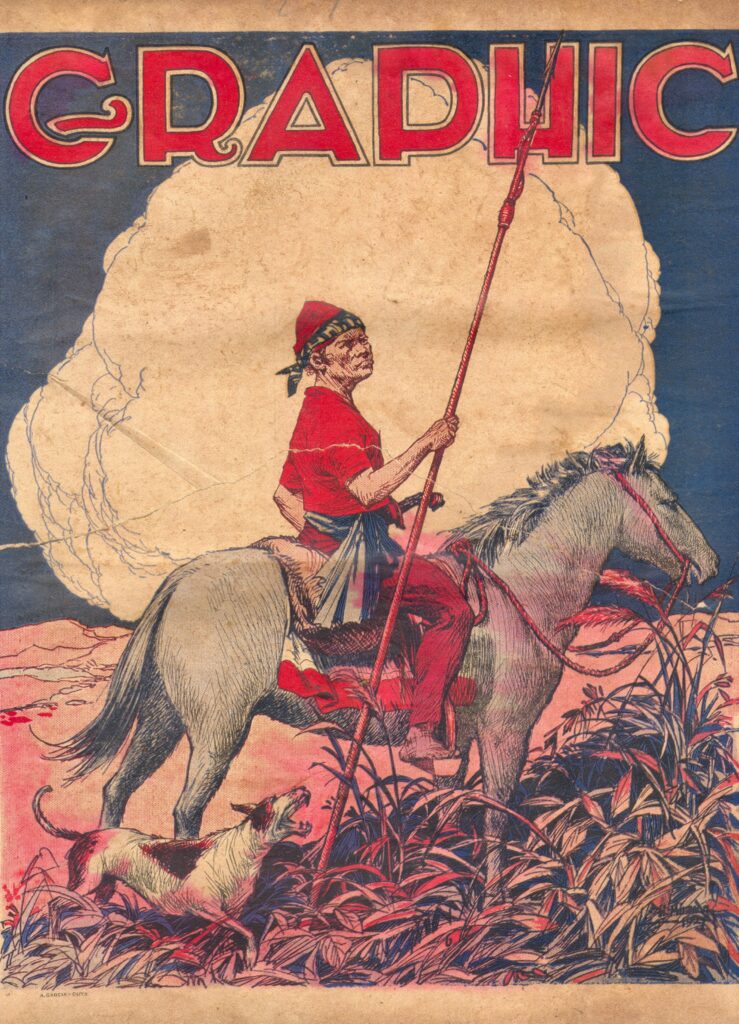
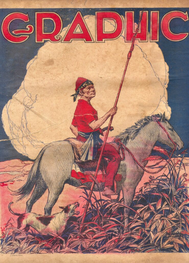
Five years later, in 1927, he launched the Graphic. In need of a cover for his magazine’s maiden issue, he turned to the “Dean of Philippine Cartoonists,” Irineo Miranda.
The image was clear, even in Miranda’s early drafts: a man riding a horse and holding a spear, guided by a dog.
CHANGES
The publication has changed ownership twice since then: from Roces to J. Antonio Araneta, and then to Ambassador Antonio L. Cabangon Chua.
During its 99-year history, the magazine evolved through several names: Graphic, Graphic Weekly, Kislap-Graphic, Philippine Graphic, and ultimately Philippines Graphic.
The magazine’s wordmark—that uniquely styled, text-only logo of a publication’s name used as its primary visual identity—had changed several times, as well.
From 1927 to the 1940s, its wordmark was characterized by bold, stylized, all caps, Art Deco front.
The name of the magazine occupied the top width of the cover in thick, geometric, block letters.
Come the 1950s, the Graphic became known as Kislap-Graphic.
The magazine focused on movie stars, pop culture, and lifestyle. Following the shift toward entertainment, its wordmark adopted a playful, lower case sans serif lettering.
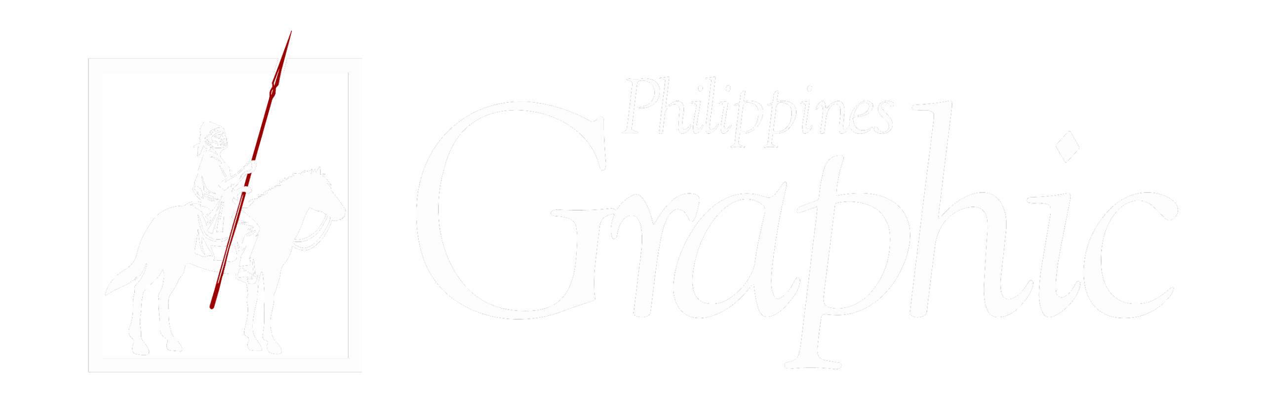
In the 1990s, the wordmark assumed the elegant, stacked layout.
It positions the word “Philippines” in a delicate, light serif typeface directly on top of the main title.
Below it, the much larger, bold, and elongated word “Graphic” anchors the design with a sweeping lower curve on its capital “G.”
All throughout, since its maiden issue, the Graphic’s visual identity has carried the recognizable stroke of maroon.
REVISITING THE PAST
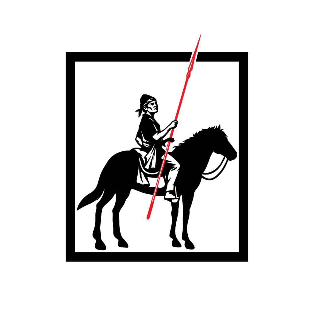
As the Philippines Graphic approaches its centennial year, it paused to rethink its direction in the coming century.
Its publisher, editors, writers, design experts, and illustrators reached out to the past and collectively discoursed on a new logo for the Philippines Graphic.
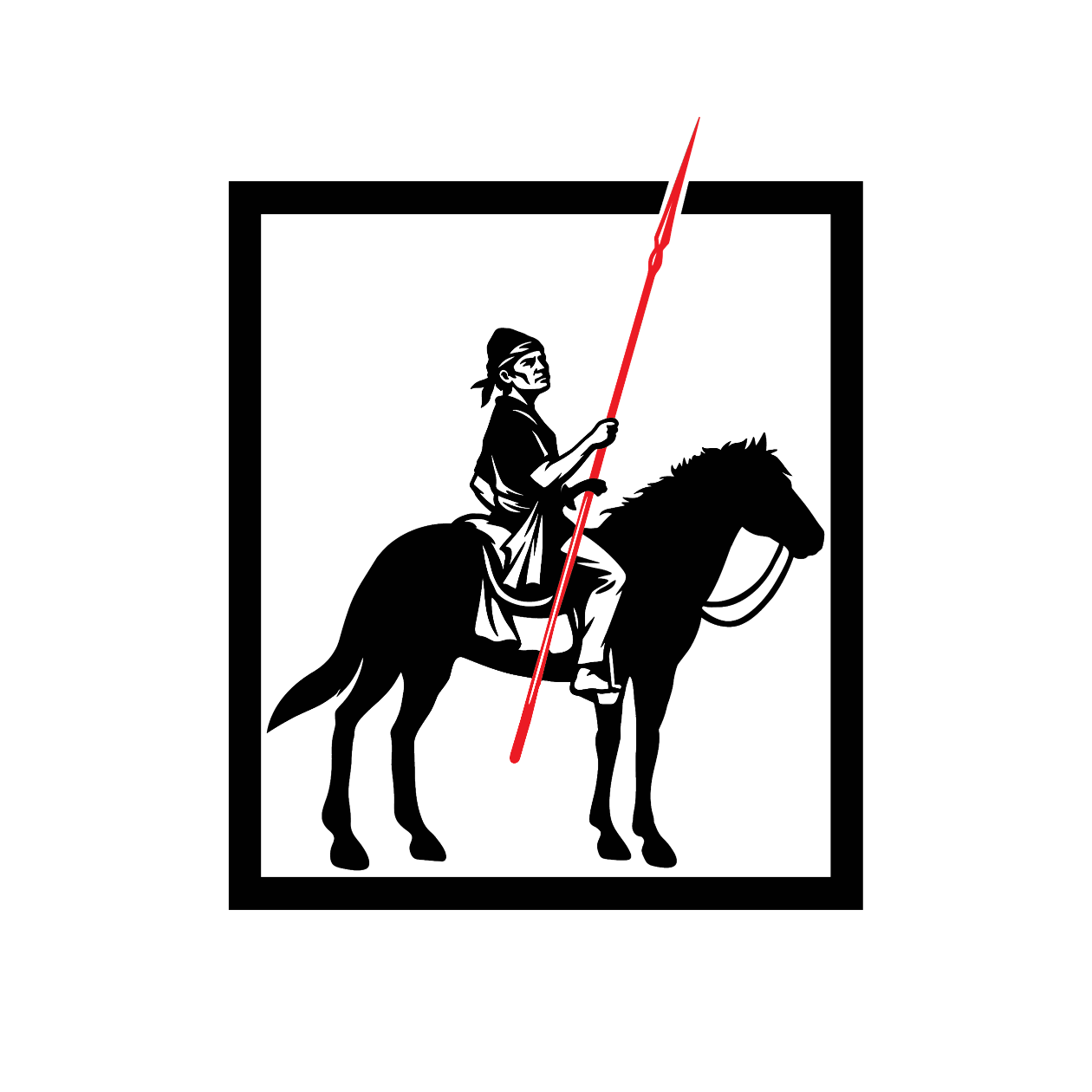
The final output is a reimagining of the first Graphic cover to bring it closer to the 21st century.
Inspired by Irineo Miranda’s historic 1927 cover illustration, this stylized design features the iconic man from Mindanao on horseback. The figure, deeply rooted in Philippine history (and, by extension, that of the Graphic), possesses the indomitable spirit of the magazine: a rider, his pose firm, his face resolute, ready to stand his ground for his people.
And since its first issue came out 99 years ago, that’s what Graphic continues to be today: firm, resolute, indomitable, and championing the voices of the Filipino people.
Von Zyron Alimorong
Von Zyron Alimorong is a writer and social media point person for the Philippines Graphic. He is based in Makati. His works often dissect human nature, infusing narratives with introspection and existentialist thought. He studied Literature at the University of Santo Tomas and served as a Literary writer for The Flame. He is also the rhythm guitarist for the band COALESCENCE.